15 years of the popular Dutch chat show 'DWDD' - in data
March 27, 2020
Since it was announced that DWDD was going to stop, people everywhere have been discussing the programme, sharing lists and drawing conclusions, often on the back of the proverbial napkin. Is there another way to do this? Researchers look for patterns in data, such as the DWDD data stored in the Netherlands Institute for Sound and Vision archive. Join us to look through the lens of the Media Suite and discover what we can find out about 15 seasons of DWDD (2005-2020) by looking purely at the data


The Media Suite is an online environment intended specially for researchers. They can use various aids that are useful for them when they want to work with large datasets. Think of advanced search capabilities, inspecting the underlying metadata, visualising patterns and making notes and annotations. Under the hood, the Media Suite uses modern techniques, such as automatic speech and image recognition, to make it easier to nose around in the radio and television archives.
Metadata
The Sound and Vision archive goes back many years, and during that time the archiving process has gone through many changes. For this ‘data story’ – a story based on data – we have looked at traditional, manually entered metadata, but also modern, automatically generated metadata. With the help of ‘artificial intelligence’ techniques, we are able to analyse and visualise 15 years of DWDD based on spoken words and images.
See the metadata for all the DWDD programmes in the Media Suite (if you have a login then you can also watch the programmes).
Examples of visualisations based on metadata that was manually entered by archivists can be seen in Figures 1 and 2. The most frequently (twice or more) discussed locations from manually annotated DWDD programmes are plotted on both a world map and a map of the Netherlands. It is not terribly surprising that the discussion was, apparently, quite frequently about the United States (on a global scale) and Amsterdam (within the Netherlands). What is more remarkable, is that Uruzgan features relatively often.
Figure 1: The most frequently discussed locations in 15 years DWDD, on a global scale (annotated by archivists).
![]() See all locations in the Media Suite (scroll down to see ‘Location discussed’, per programme or segment in the programme, on the lefthand side. Click on the three vertical dots for sorting options).
See all locations in the Media Suite (scroll down to see ‘Location discussed’, per programme or segment in the programme, on the lefthand side. Click on the three vertical dots for sorting options).
Figure 2: The most frequently discussed locations in 15 years DWDD, in the Netherlands (annotated by archivists).
![]() See all locations (Dutch and global) in the Media Suite (scroll down to see ‘Location discussed’, per programme or segment in the programme, on the lefthand side. Click on the three vertical dots for sorting options).
See all locations (Dutch and global) in the Media Suite (scroll down to see ‘Location discussed’, per programme or segment in the programme, on the lefthand side. Click on the three vertical dots for sorting options).
As we use manually entered metadata in the statistics above, we know that they are very reliable (the chance of an error is small) - but also that it is highly likely that we have missed some locations that were discussed or mentioned. Suppose that we were to go through the programmes word by word and count up how often locations were mentioned, then we would come up with different numbers. The question then is whether the fact that a location was mentioned also means that the discussion was really about the location. This interpretation step is traditionally done by the archivist.
With relatively simple means, we could do some sort of automatic interpretation: for example by counting how often a location was mentioned within a certain timeframe. We could also go beyond the spoken word. The metadata from the Sound and Vision archive consists of descriptions that represent how human archivists interpret the events in a programme. But because TV is a visual medium, it is eminently suited to image analysis: letting software examine each programme and analyse the images.
TV history
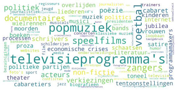
The 27th of March 2020 brought the end of an era in Dutch TV history. DWDD was one of the most popular - and influential - programmes on television. DWDD was characterised by the rapid tempo with which the subject was changed, and the wide range of subjects that were brought to the table. With the Media Suite we can make that variety visible by showing the subjects in a word cloud, as shown below in Figure 3. Here you can see the subjects that archivists annotated DWDD programmes with.
 Figure 3: Word cloud of the top 100 most frequently occurring subjects (annotated by archivists).
![]() See subjects in the Media Suite (scroll down to see ‘Subject’ on the lefthand side. Click on the three vertical dots for sorting options).
See subjects in the Media Suite (scroll down to see ‘Subject’ on the lefthand side. Click on the three vertical dots for sorting options).
Distant and close reading
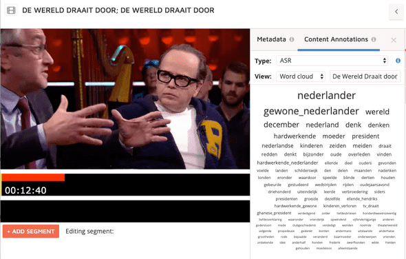
Representations such as word clouds can give an overview of the spread of subjects over all DWDD programmes, in a sort of birds-eye view. This is also called distant reading. With the Media Suite you can zoom in further, for example to see the exact number of programmes for each subject, as seen below in Figure 4. Ultimately, the individual programmes and their subjects can be viewed and analysed, as is shown in Figure 5. This is called close reading.
Figure 4: Top 10 most frequent subjects in terms of number of DWDD programmes, measured in the period 2005-2015.
![]() See subjects in the Media Suite (scroll down to see ‘Subject’ on the lefthand side. Click on the three vertical dots for sorting options).
See subjects in the Media Suite (scroll down to see ‘Subject’ on the lefthand side. Click on the three vertical dots for sorting options).

Figure 5: Screenshot of a word cloud on the level of an individual programme in the Media Suite, to assist ‘close reading’. Clicking on a term takes the viewer to that fragment in the programme.
![]() See this word cloud in the Media Suite (select the ‘Content Annotations’ tab and choose ‘Word cloud’ from the dropdown). Users with a login can also watch the programme.
See this word cloud in the Media Suite (select the ‘Content Annotations’ tab and choose ‘Word cloud’ from the dropdown). Users with a login can also watch the programme.
Data criticism
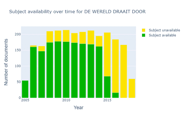
What is important to tell about the statistics above is that when looking at the ‘exact values’ in Figure 4, it is essential to take into account the fact that the data are not always complete. The subject was actually filled in for 35% of the DWDD programmes. This can have many reasons. Manual annotation of subjects is a lot of work, and at different points through the years there was more or less time available for this, or there were changes made in annotation procedures. See also Figure 6 below that shows that the subjects were not always filled in over the lifetime of the programme, in particular in recent years.
 Figure 6: Overview of the availability of subject labels in DWDD over the years.
The Big Bang
DWDD was probably most influential in bringing complicated subject matter to a wider audience. Robbert Dijkgraaf explained the Big Bang in simple terms, and the day after an item by Alexander Klöpping we could all converse about the latest technological developments. In Figure 7 we can see that science was well represented in DWDD. Our assumption would be that if we compared the number of scientific subjects discussed in DWDD with another TV programme, that DWDD would win hands down. Indeed, we see in Figure 8 that DWDD scores very well compared to current affairs and chat shows.
Figure 7: Top 10 most frequently discussed scientific subjects (annotated by archivists) in terms of number of DWDD programmes, measured in the period 2005-2015.
Figure 8: Number of programmes in which certain scientific subjects were discussed (annotated by archivists), measured in the period 2005-2015.
![]() See the subjects of
DWDD,
chat shows and
current affairs programmes in the Media Suite (scroll down to see ‘Subject’ on the lefthand side)
See the subjects of
DWDD,
chat shows and
current affairs programmes in the Media Suite (scroll down to see ‘Subject’ on the lefthand side)
The data speaks for itself
Matthijs van Nieuwkerk, the presenter of DWDD, is well known for speaking fast. An average speaker speaks 130 words per minute, a fast speaker 160. The question is, can we calculate Matthijs van Nieuwkerk’s speaking speed? To do this we used two automatic techniques: speaker recognition to see who speaks when and speech recognition to count the number of words. We measured Matthijs’ speaking speed in 266 DWDD programmes. For comparison, we measured the speaking speed of another popular chat show host, Eva Jinek, in 39 editions of her programme ‘Jinek’. For Matthijs we found an average speed of 176, and for Eva 175. So both are fast talkers!
While Matthijs and Eva both talk equally fast during the show, the speed of their intro varies (we took the first 2 minutes to be the intro). For Matthijs the speed goes up to 181, so a bit faster, while Eva, in contrast, slows down to 165. Does the intro set the tone for the programme? An interesting research project could be to investigate if the speaking speed of presenters has changed over the years.
With the help of speaker recognition, we can also calculate for how much of the programme time the presenter is speaking. In Figure 9 we compare Eva Jinek, Matthijs van Nieuwkerk and another popular Dutch talk show host, Jeroen Pauw, during the 2018 and 2019 seasons. We see that Eva Jinek appears to give her guests more room, and speaks less herself, than Matthijs and Jeroen do. Perhaps an interesting topic for follow-up research by an intern: do female talk show hosts let their guests speak more than their male colleagues do?
Figure 9: Percentages of the programme for which the presenter is speaking.
Matthijs is DWDD
As DWDD began its final month, the Top 5 most viewed DWDD programmes were as follows:
- 23rd March 2015: 2,151,000 viewers
- 20th January 2017: 2,016,000 viewers
- 9th November 2016: 1,998,000 viewers
- 8th January 2014: 1,782,000 viewers
- 2nd March 2018: 1,767,000 viewers
In the last week of DWDD all these programmes were summarily knocked out of their positions, and the new Top 5 became the 23rd, 16th, 20th, 19th and 17th March 2020, which are now the most-watched DWDD programmes ever (between 2,151,000 and 4,561,000 viewers). The coronavirus was the common thread running through all these programmes. Is Matthijs Holland’s hope in dark days? Or do Dutch people dislike change? What is certain, is that DWDD peaked in popularity with the very last broadcasts.
In the beginning, DWDD was actually presented by Francisco van Jole (23 times between the first broadcast and December 2005). From the Media Suite we can see that Claudia de Breij presented DWDD 57 times over the years. Yet it is mainly Matthijs van Nieuwkerk who is to thank for the popularity of DWDD. Matthijs is DWDD.


Figure 10: Visualisation of Matthijs van Nieuwkerk with one keyframe per month in 15 seasons.
Do you see a change in clothing style? We asked ourselves how, over all those years, the programme’s visual style had changed - or not. For this reason, we zoomed in on a very characteristic part of the format - the DWDD opening shot.
Arms crossed
To look at 15 years of opening shots, we applied image analysis in two steps. First we used automatic shot detection to cut the programme up into different shots. For each shot in the programme, we had a single image. With these images, we applied machine learning and trained a model to specifically detect opening shots.
Thus armed with a genuine opening shot detector, we went through 2826 programmes - to find very many shots of Matthijs van Nieuwkerk with his arms crossed! You can explore the poses since the start of DWDD in the interactive figure below (Move your mouse over the image to see the individual shots).
Figure 11: 15 years ‘welcome’ by Matthijs van Nieuwkerk in one image per month. Move your mouse over the image to browse through the years
Working with the Media Suite
The Media Suite is an online research environment, managed by Sound and Vision, that is developed by the CLARIAH project specially for (data-driven) research. The Media Suite offers access to multimedia sources from various Dutch archives, such as that of Sound and Vision, enriched with the aid of speech and image recognition. Read more about the Media Suite.
By analysing data, you can discover trends - or anomalies. The data visualisations in this blog give a picture of DWDD as a whole, and reveal peculiarities that raise more questions.
A critical view of data
Data does not offer absolute truth. Data is coloured by the processes with which it is gathered. Previously, DWDD programmes were manually annotated with metadata. Since 2015, a great deal of metadata is automatically generated, for example by recognising speech, voices or faces. Manual metadata are usually of high quality, but, over the years, the way of working has regularly changed. As a result of these changes, there can be differences in both the quality and the richness of the data. For example, we can be pretty sure that someone who was annotated as a guest, is indeed the person who actually appeared in the programme.
But suppose that, in the same programme, someone briefly appeared as a guest who only later became a household name in the Netherlands. That person may not have been noted by the archivist. This is the advantage of automatic processes: if someone spoke a few sentences, then years later we can still find them. Naturally automatic processes can also make mistakes, and as a result create noise. For this reason we follow two principles when applying automatic techniques: we carefully monitor the quality and offer researchers as much insight as possible into the methods used, so that they can interpret the data from the tools themselves.
With contributions from: Philo van Kemenade, Wytze Koppelman, Nanne van Noord, Roeland Ordelman, Muriel van Peteghem en Mari Wigham.
